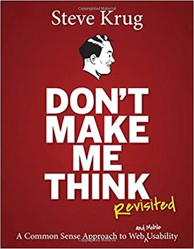
Don’t Make Me Think: A Common Sense Approach to Web Usability by Steve Krug
Don’t Make Me Think, by Steve Krug, is an easy-to-read guide on web usability which starts by posing the concept of making the web user experience as easy and unintimidating as possible. Krug has extensive experience as a web usability consultant, and shares his wealth of knowledge and best practices across the book.
Krug starts with the basics, talking about concepts such as "bandwidth" - a measure of how well a website communicates its intended message. He explains that people don't necessarily pay attention to everything they see on a website, only what they find important. His goal is to show people how to efficiently deliver the desired message without wanting people to read every single word.
Next, Krug dives into web design and discusses the importance of a good user interface. He emphasizes the importance of giving the user an interface that is easy to use, such as avoiding elements that confuse or distract the user, and using visuals such as navigation bars and other navigation aids. Krug advises that interface elements should be as predictable as possible, as this will keep users from having to stop and think to understand how to use the interface.
Krug goes further into web design and talks about his "Three Click Rule", which states that everything a user needs should be accessible within three clicks or less. He cites studies which have concluded that when users are presented with too many choices and have to navigate through too many levels, they tend to become overwhelmed or impatient. The main underlying concept is that the user needs to be able to access the desired content or information quickly and easily, regardless of how many levels there are.
In the remaining chapters, Krug talks about various aspects of the user experience including content, visuals, and organization. He writes extensively about web copy - the text that appears on a website - and emphasizes the importance of making sure it's simple, clear and succinct. He emphasizes that website copy should only be used to make the user's experience better and should not bog readers down with unnecessary jargon.
Krug also delves into the use of visuals, such as images and videos, on websites and the importance of making sure they are relevant and effective. He advises that visuals should be used to illustrate a point, or to simply make the website more interesting and appealing.
Finally, Krug discusses the concept of organization, which he defines as providing a logical and consistent structure to the web page and content. He explains that this helps provide an orderly flow to the information and guides the user through the website in a way that makes sense. Organization often includes the use of headings, subsections and other structural elements to help guide users through the content.
Overall, Krug's book Don't Make Me Think provides an exhaustive and comprehensive guide to web usability. His experience and tips are immensely helpful to both web developers and users alike and serve to simplify the often daunting task of web usability. With helpful and practical advice, Krug's Don’t Make Me Think is sure to become a staple in the web development industry.

